What is Histogram
Histogram is a chart that helps us discover and present continuous data basis frequency distribution. It is sort of bar chart just the major difference is that histogram used to show frequency of data in the data set which has been divided in classes also known as bin.
Histogram also helps us to find underlying distribution of data, outliers, skewness and kurtosis. It helps us to check how the output of a process looks like, is process able to meet customers requirement and many more other thing.
How to create Histogram in excel
I will explain 2 methods of creating Histogram in excel
By creating frequency table:
We have a data set of few samples and its measurement received. In this scenario we will first decide bins for creating histogram as per our requirement. I have broken this data into 6 bins started from 5 to 30.After fixing our bins we will use FREQUENCY formula of excel to get the frequency of numbers which is less than the bin value and more than the previous bin value.
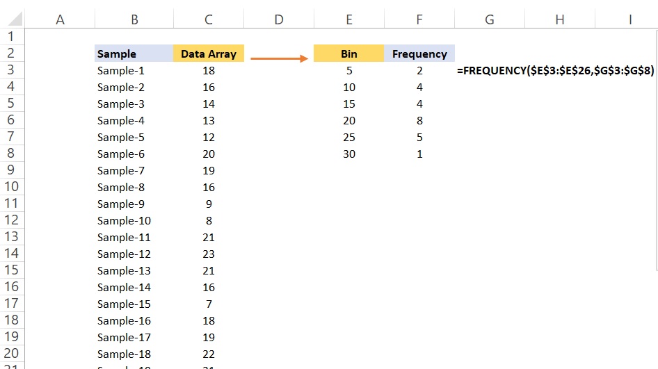
After calculating frequency of data set we will use column or bar chart. To get a bar chart in excel we will got to Insert >> Insert column or Bar chart. A chart will come as below.
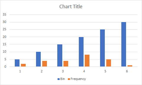
We will make few changes in this by selecting SELECT DATA after right clicking on the chart. A new popup will come as below.
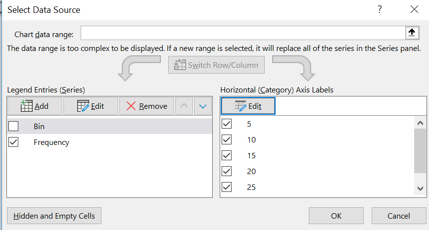
We will uncheck bin option and use Edit option from right side to select bin data from excel. Chart will modify as below.
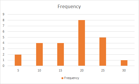
Now it looks like histogram and presenting our data basis the selected bin.
By using excel’ s inbuilt histogram chart
To create Histogram by using excel‘ s inbuilt histogram, first we will select our data set then will go to Insert >> Insert Statistics Chart >> Histogram . A new chart will as illustrated in the below image.
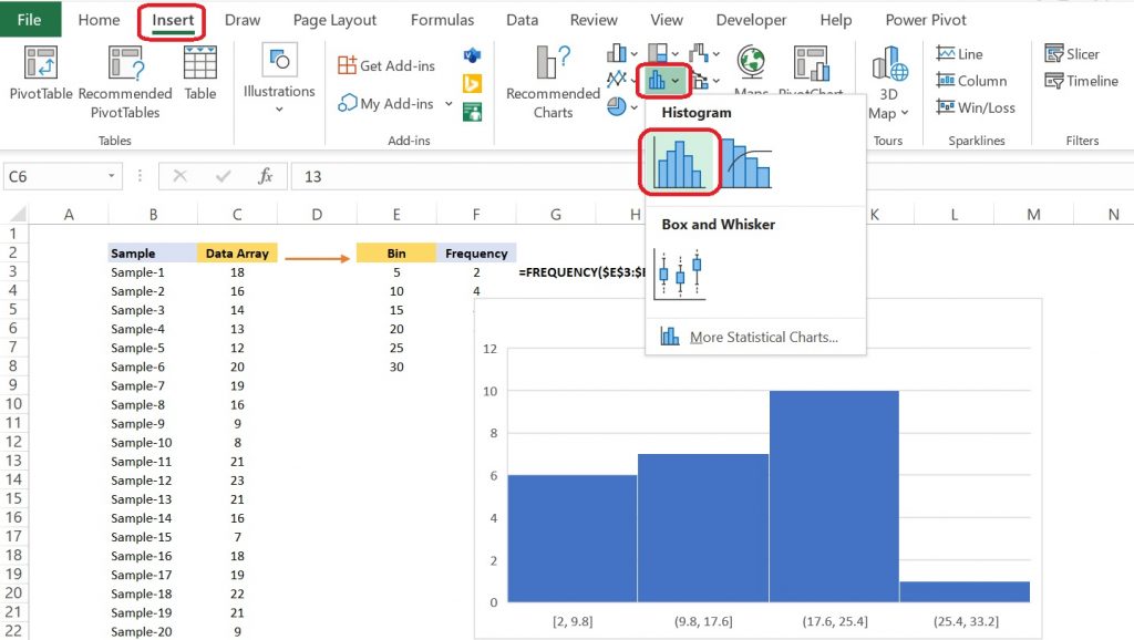
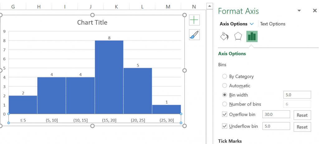
Now we can do some changes in different setting to make it look more visual friendly. We will right click on the chart of axis and then select Format Axis. A new box will emerge on right side. This box provides multiple options to control bin size.
- Bin width: asks for the width of bin by which data frequency will be shown.
- Number of Bins: it asks for number of bins by which dataset needs to divide.
- Automatic: System will select bin by it’ s own.
- Overflow Bin: Any value above this number will be placed into a kind of “all other” bin.
- Underflow Bin: Any value below this number will be placed into a kind of “all other” bin.
We will choose 2 options here Bin Width as 5 and Overflow and underflow bin as 30 and 5 respectively. Now the New chart will look as previous chart.
When to use Histogram:
| S.N. | When to use Histogram |
|---|---|
| 1 | When data is numeric. |
| 2 | When we wanted to see the distribution of data |
| 3 | Determining how two sets of data are behaving |
| 4 | To analyzing whether a process can meet the customer’s requirements. |
| 5 | To see whether a process change has occurred from one time period to another |
There are other settings available as well which you needs to explore by yourselves. That includes but not limited to size, color, gap between bins.
You can also read more from below link to explore it further.

