How to create a Pareto Chart in Excel
Pareto Chart is the presentation of Pareto principles also known as 80/20 rules, the law of the vital few, or the principle of factor sparsity is used in statistics and quality control. This principle explains 80% of the consequences come from 20% of the causes( the vital few). This 80/20 proportion can be changed in practical life based on the actual requirement. Examples of the Pareto principle is given below:
- 80% money earned by 20% of people.
- top 20% reported bug causes 80% system crash
- 20% of drivers cause 80% of all traffic accidents.
- 80% of the pollution originates from 20% of all factories.
- 20% products of a company generate 80% revenue.
What is the use of Pareto chart:
Pareto charts are used in quality improvement. By using the Pareto chart we can see the frequency of defects and their accumulative impact on overall defects. It helps us to prioritize those defects which have the highest impact.
How to create Pareto chart in excel:
There are two methods by which we can create a Pareto chart in excel 1) By traditional method(Using column chart) 2) by using excel’s inbuilt Pareto chart. We will take the same dataset to create it.
By traditional method
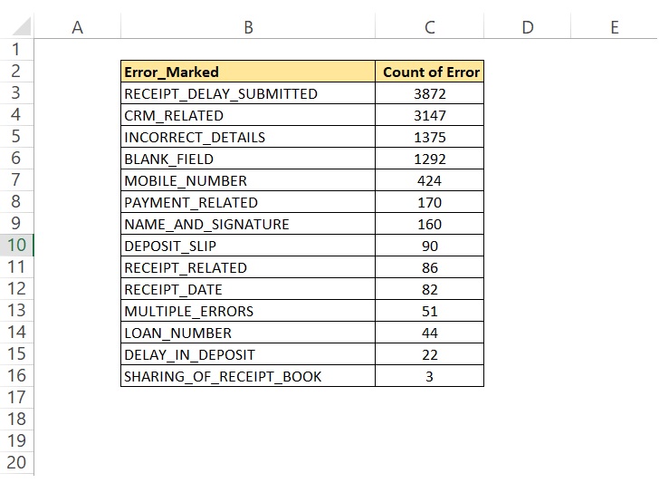
We have a data set of errors marked for field collection’s team performance as mentioned in the below table. Data of count of error are in descending order, means higher to lower.
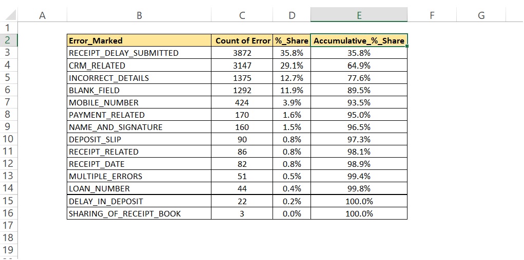
Now we will add one column after column count of error and will name it %_Share, which means share in overall data. Every row in this column will divide by the sum of this column and will change data format as %age. After that, we will add one more column Accumulative _ % _Share. In this column, we will add the %_Share of each row by its previous row except the first row which will have its own value. Now the table will look like as illustrated in the below image.
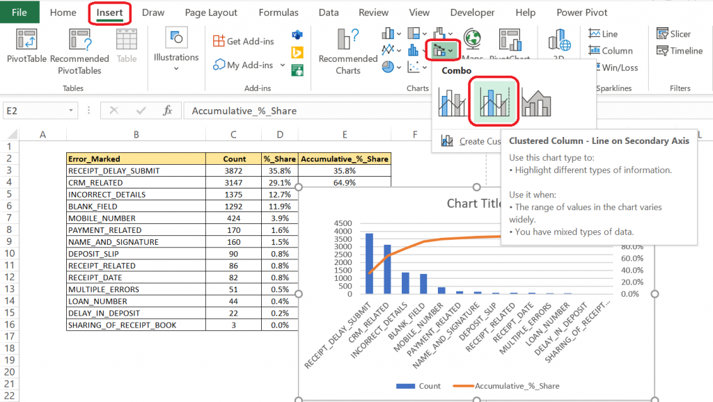
Now after calculating %_Share and Accumulative _ % _Share, we will plot a combo chart Clustered Column – Line on Secondary Axis as shown below.
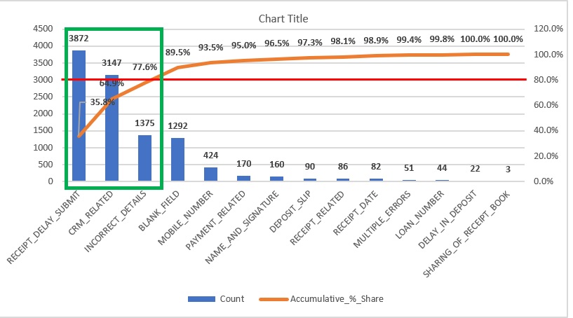
Now we will do some modifications to this chart like size and category alignment. After that, we will put a line on 80%(can be different no. depending on our requirement). Now we can see there are 3 errors that contribute to 80% of the overall error. So, by looking at this graph it helps us in understanding that we need to work primarily on 3 errors that contribute highest, and by a reduction in these will reduce overall errors drastically. If we work on the reduction of all errors it will be time-consuming as well as the impact will be very low.
By using excel’ s inbuilt Pareto chart
To use this option we will first select our data then will go to Insert >> Insert Static Chart >> Pareto as shown in the below image.
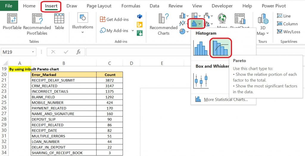
After clicking this option we will get a new chart a combination of Histogram and line chart.
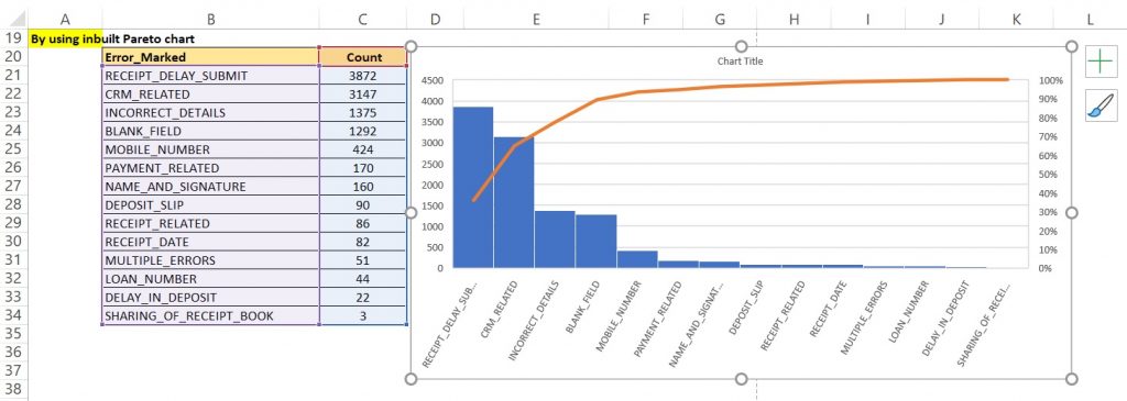
By using any of the graphs we can analyze our data come come to a conclusion.
Pareto Chart has few advantage and disadvantage as well as mentioned below:
| S.N. | Advantage | Disadvantage |
|---|---|---|
| 1 | It helps us to identify and determine the main cause i.e. root causes of defects or problems | This alone can’t be used to analyses the root cause problem. |
| 2 | It prioritizes defects and problems by sorting them in decreasing impact order. | It only shows qualitative data and doesn’t show the severity of the defect or problem. |
| 3 | With help of the Pareto chart, the skills of individuals are also increased in better ways like problem-solving skills, decision-making skills, | It vastly depends on past data but no prospect is being considered. |
That is all for Pareto chart for now. Will connect again with something new.

