What is a thermometer chart?
A thermometer chart is a visualization technique that is used to show a single parameter against the predefined target. This chart looks like a thermometer due to this it is called a thermometer chart. The filled part goes up as the achievement increase. It shows the percentage of achievement done. It is not an in-built chart in excel though we will create it by column chart.
How to create a thermometer chart in Excel
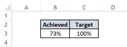
To create a thermometer chart in excel we first need to arrange our data in a particular format as motioned in the below image.
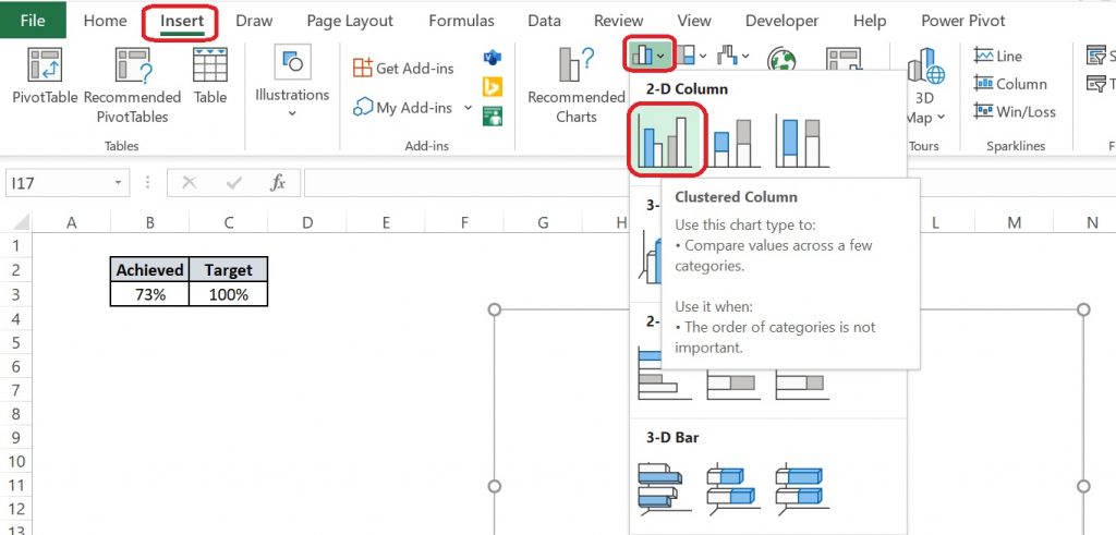
Now after selecting our data we will go to Insert Tab >> Insert Column and Bar Chart >> Clustered Column.
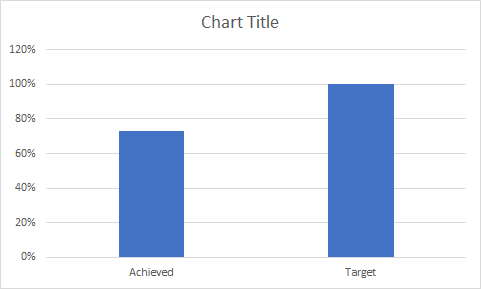
After selecting clustered column option we will get a chart as below.
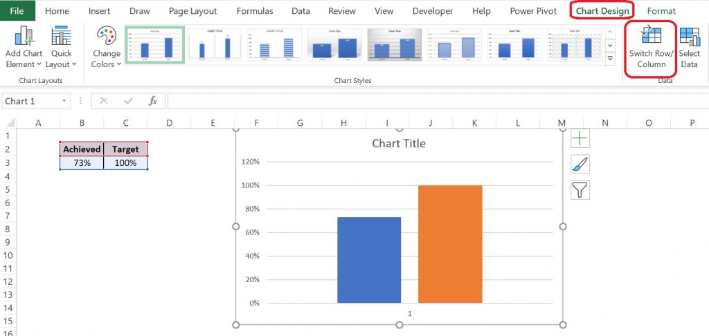
Now we will go Chart Design tab and will select Switch Row/Column option. New chart will look like as below image.
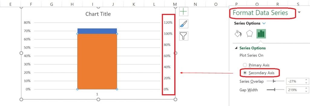
Our next step will be to double click on the Target column and choosing Format Data Point after right-click on it. A new floating box will come on the right side we need to change Primary Axis to the Secondary Axis.
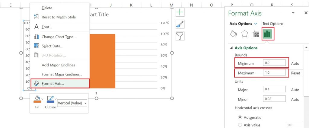
Now we will again right-click on the primary axis and will select Format Axis. Now in Axis Option, we will change Minimum and Maximum Bound as 0 and 1 respectively. The same activity will be done for the Secondary Axis. Both the primary and secondary axis will be selected as 0% and 100%.
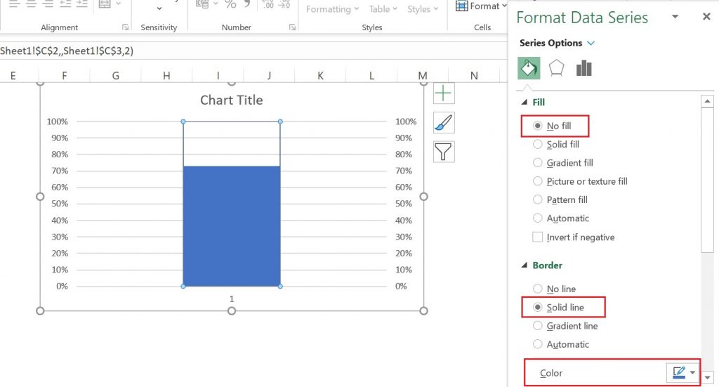
As we can see there is only one column visible while the other is hidden. To make it visible we will click on the column then select Fill as No Fill, border as a solid line, and color as blue.
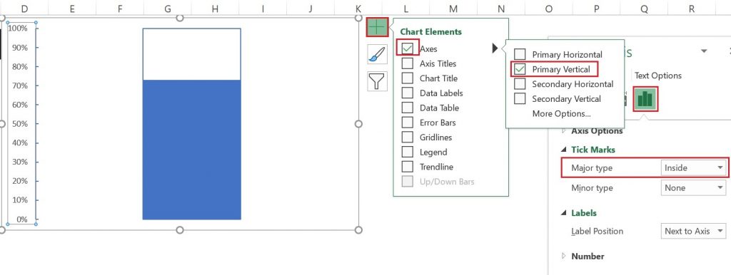
Now we will select the Chart Element option and will select Axes only, in the Axis option Primary Vertical and the Axis Options from the right side floating box under Tick Marks in Major types will select Inside. The process is illustrated in the below image and also new chart is shown.
Now further few more changes done as illustrated in the below image.
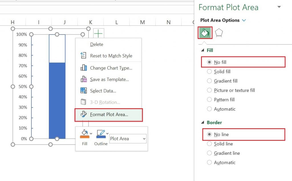
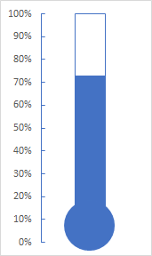
Resize the chart and add an oval shape at the bottom of the chart, we are ready with our thermometer to chart with the actual value against the target. We can do some more formatting to make it more appealing.
You can read the below blog post for further knowledge.
https://www.educba.com/thermometer-chart-in-excel/

