How to make different Line Charts in excel
What is Line Chart In excel
Line charts are a form of data presentation that helps in presenting data in a simple and meaningful way. The line chart is the simplest and easiest to understand among all charts. It is very helpful in showing some trends over time.
How to create Line Chart in Excel
To use line chart in excel we will go in Insert tab then Insert Line and Area Chart.
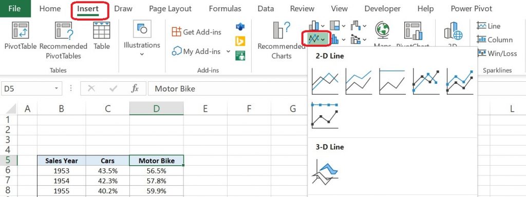
What type of line charts are available in excel
There are two types of line charts available in Excel:
- 2-D Line Chart
- 3-D Line Chart
2-D Line Chart
2-D Line Chart has 3 different kinds of charts Line, Stacked line, and 100% Stacked line with and without markers. Let’s discuss the applicability of these charts.
Line chart is used when we have many data points to plot in a chart or data is in time series or shows trends over time(years, months, or days). To use this chart we will follow the same process Insert >>Insert Line and Area Chart >>Line. A line chart will come like the below image.
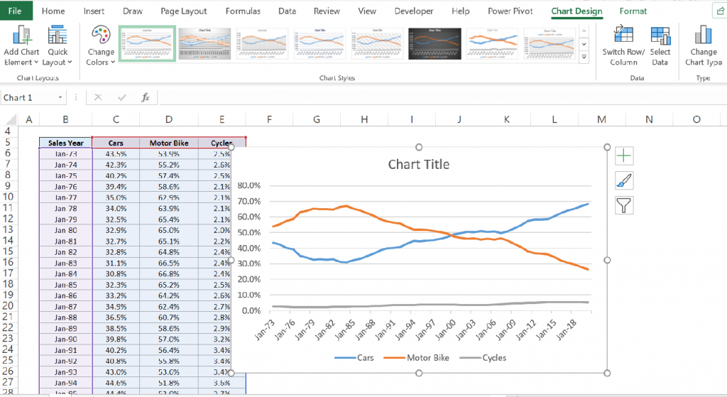
We can decorate it as per our requirement. I will be discussing this in another blog post.
Stacked Line shows how parts of a whole change over time. Here, lines are plotted one at a time, with the height of the last one plotted variable serving as a moving baseline. As such, the fully-stacked height of the topmost line will correspond to the total when summing across all groups. Let us understand this from the below example.
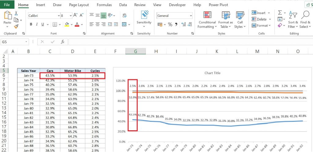
In this example, if we see all three variables are showing with their data labels as 45.5%,53.9%, and 2.5%. The last variable Cycle is on the top and making baseline at 100% which is the sum of all the three variables. As here sum of all variables in all rows is 100% due to which baseline is straight otherwise it could vary on point.
100% Stacked Line Chart is a chart in which lines do not overlap because they are cumulative at each point. The lines reach a total of 100% of the axis range at each point. Lines are getting space in the chart as per their share % among all variables. Let us understand this by the below example.
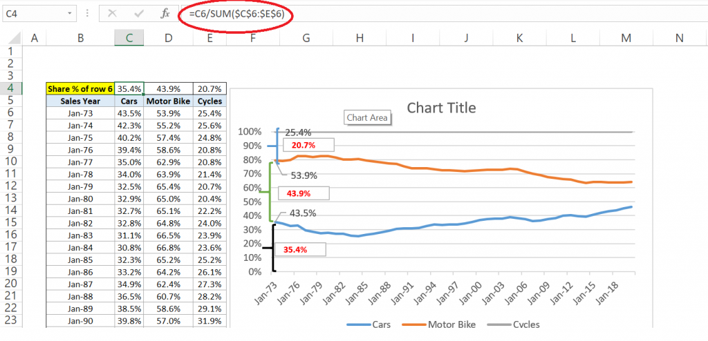
In the above example, we have calculated share% of all 3 values and it is in row 4. Here, Car is the first variable and its share % is 35.4%. The chart also occupies 35.4% value for this variable as can be seen by black left brace.
Now we are coming to the 2nd variable which is Motor Bike, it’s % share 43.9% and in the chart, we can see the same value has been allotted to it as well and can be seen in green left brace. Similarly, 20.7% value left after allotting the 2 variables which is not allotted to Cycles.
3-D Line Chart
3-D Line Chart is used to demonstrate time-series data or trends over the year, week or days. It just presents data on a third axis which will show some lines in front of others.
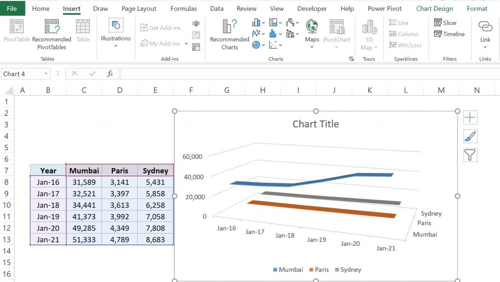
That’s all now for line charts. We will cover further how to decorate and make it more visible in some other posts.
You can watch this video as well for more clarification.

