Funnel Chart
Funnel Chart is a special kindly of chart which is used to visualize the progressive reduction of data when it passed from one process to another. Data in each process is represented as a different portion of 100%. There is multiple kind of analysis where it is required like the admission process for a course, recruitment funnel, product sales, etc. The values in each process are gradually decreasing.
How to create Funnel Chart in excel
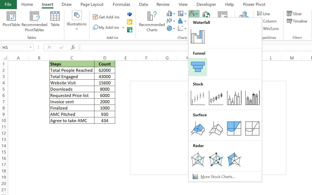
First and foremost we will arrange our data in descending order. Then we will go to Insert tab >> Insert Waterfall, Funnel, Stock, Surface, or Radar Chart >> Funnel.

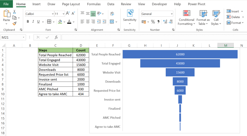
After clicking the Funnel option we will get it as below.

Its creation is very easy and it is a very powerful visualization tool as well. The main advantages for creating it is that it is easy to understand and exposes bottlenecks in a process. Though there is a disadvantage that it is not very effective in decision making for individual analysis.
Tips: It is to be noted that unlike other charts funnel charts doesn’t use any axis.
You can read more article on funnel chart from below link:
https://www.fusioncharts.com/resources/chart-primers/funnel-chart
https://chartio.com/learn/charts/funnel-chart-complete-guide/

