What is Sunburst and Treemaps charts
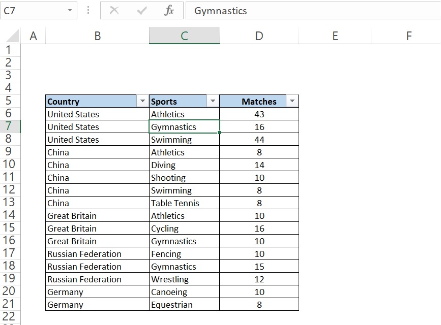
Sunburst and Treemaps charts are hierarchical charts which is used to show multi level variable values. We will be using this chart type to compare parts to a whole, or when several columns of categories form a hierarchy. Let us take an example of Olympics to understand this. We got data of matches participated in Olympics by different countries for different categories of games. We can see the data in the below image.
From the above data set if we want to plot bar chart, Line chart or pie chart then chart will not show complete data by any of the charts.
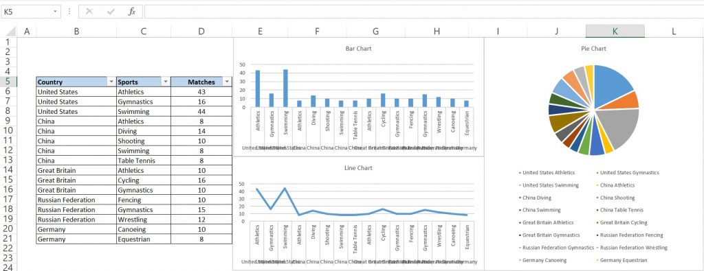
To overcome this problem we will use Sunburst or Treemap chart. The both charts compare values across hierarchical level. It will show proportions within hierarchical levels as rings or rectangles.
How to create Sunburst or Treemap chart in excel
To create any of these chart we will select our data and then will go to Insert >> Charts >> Insert Hierarchical Chart as shown in the below image.
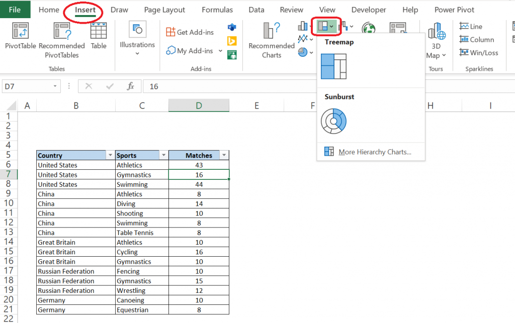
Now we will select any of these two options as per our requirement. It is to be noted that if there is less category in data then we will select Treemap else Sunburst. To understand this it better we will select Treemap after selecting our data points. Treemap chart will come as shown below.
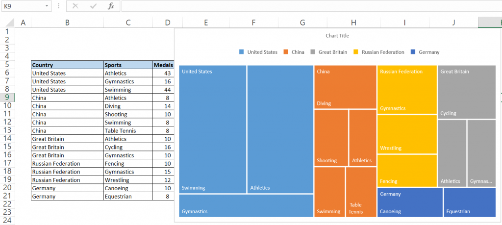
Let’s interpret the above chart, first blue portion represents United States and it’s width is proportionate to the values of Unites States in overall data. If we look carefully the area of United States is little less than half of the chart and if we will calculate the proportion of United States in the overall data then it is about 42%,so it is almost the same. Now when we see it further we see United States which is in blue is divided in three parts which athletics, gymnastics and Swimming. All these three are again divided proportionally within United States.
Further we can improve these charts by using chart design and format options. We can see these option when we will select the chart. See below image in highlighted portion.

Now we will create Sunburst chart with the same data. It also presents data in the same way, just the difference is in Sunburst chart data is shown in the ring instead of rectangle.
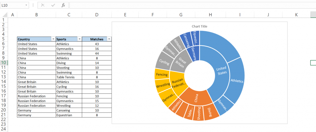
That’s for now from me, do some practice on this to explore more.
You can read below article as well for more understanding
https://www.myexcelonline.com/blog/create-sunburst-chart-excel-2016/
https://www.excel-exercise.com/sunburst-chart/
https://www.laptopmag.com/articles/make-treemap-excel
You can watch below video as well for better understanding on this.

