Understanding and interpreting boxplots
What is boxplot
Boxplot also known as box and whisker plot is used in explanatory data analysis. It is used to show the variance and central tendency of any data set. By this, we can visually represent the distribution of data in a dataset. It also helps in comparing two or more sets of data.
How box plots look like
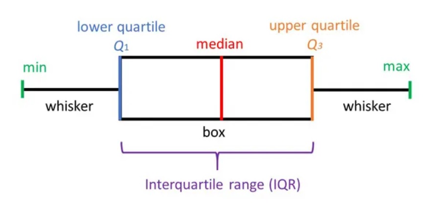
Box plot is a standardized way of showing distribution of data on the basis of five number summary.

PS: Above image is taken from https://www.simplypsychology.org
In the above image, we can see the five summaries as the minimum(min), Q1(lower quartile), median(Q2), Q3(upper quartile), and maximum(max). We also see min and Q1 are connected by a whisker and also Q3 and max, though Q1 and Q3 are connected by a box which is divided by median(Q2).
You can read this to know about mean and median while to read Q1 and Q3 can be read here.
- Min – Minimum value in the data set.
- Max – Maximum value in the data set.
- Q1 – also known as 1st quartile or 25th percentile is the middle value between median and minimum.
- median/Q2 – It is the middlemost number of the data set when sorted in ascending or descending.
- Q3 – also known as 3rd quartile or 75th percentile is the middle value between median and maximum.
How to create a box plot in excel
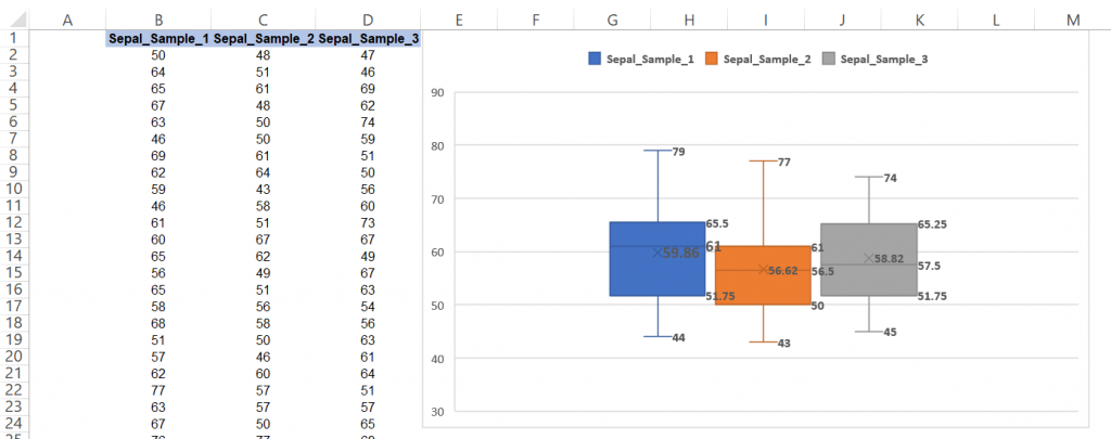
To create a box plot first we need to select our data then go to Insert >> Insert Statistic Chart >> Box and Whisker. A box plot will created as below.

How to read a box plot
In the above chart, we have taken 3 sets of data from some sampling. In this data, we see the highest maximum number is available in sample_1 while the lowest minimum is in sample_2. Also, we see the highest median is for sample_1 while sample_2 and sample_3 have almost the same median which means there is likely to be different than the next 2 groups. The size of the box means the interquartile range is less for sample_2 as compared to sample_1 and sample_3 which infer variation in sample_2 is less as compared to the other 2. Kindly note here the x signal in the boxplot here shows the mean of the data sets.
Advantages and disadvantages of boxplot
| S.N. | Advantages | Disadvantages |
|---|---|---|
| 1 | Represents data distribution of the dataset | Doesn’t show individual values |
| 2 | Provides 5 statistical summary | It can be used only for numerical data. |
| 3 | Outliers don’t affect | The mode cannot be identified in a box plot. |
| 4 | Very good for comparing data |
That’s all for now, will meet again with some new posts.
You can read more about Boxplot form the below link

