
Introduction: Why the Right Chart Changes Everything
Think about the last time you looked at a report and instantly understood it. That clarity did not happen by accident. Someone chose the right visual to carry the message — and it worked.
Data is everywhere today. Companies collect more of it than ever before. But collecting data and communicating data are two very different things. The gap between raw numbers and real understanding is exactly where data visualization best practices come in.
Most people assume that a chart is just a chart. Pick whatever looks good and move on. That thinking is where data storytelling breaks down. A poorly chosen chart does not just look bad — it actively misleads the audience. It buries the insight. It creates confusion instead of clarity.
We have worked with businesses across industries to transform raw data into compelling visual stories. What we see repeatedly is this: teams have strong data but weak presentation. The result is that decisions slow down, stakeholders lose interest, and insights never reach the people who need them most.
This guide is your practical chart selection guide. By the end of it, you will know how to match your data to the right visualization — every time. Let us get into it.
What Is Data Visualization and Why Does It Matter?
Data visualization is the practice of representing data in a graphical or visual format. Instead of reading rows of numbers in a spreadsheet, you see a line that rises or falls. Instead of a table of percentages, you see a pie chart. That shift from numbers to visuals is where meaning is created.
According to MIT research, the human brain processes visuals 60,000 times faster than text. (Source: MIT News, “Brain Processing of Visual Information,” 1996.) That statistic alone tells you why effective data presentation is not optional — it is essential.
When data is visualized well, three things happen. Audiences understand the message faster. They retain the insight longer. And they are more likely to act on what they have learned.
When data is visualized poorly, the opposite happens. Confusion spreads. Trust erodes. And the data — no matter how accurate — becomes useless.
This is why choosing the right chart is not a design decision. It is a strategic one.
The Core Problem: Choosing the Wrong Chart
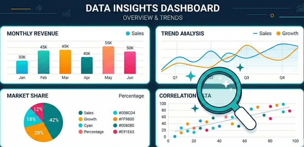
Here is a real problem that happens every day in businesses. A marketing team pulls monthly sales data and drops it into a pie chart. The pie chart has twelve slices — one for each month. Every slice looks roughly the same size. Nobody can tell which month performed best. The insight disappears.
That same data, placed in a simple bar chart or line graph, would have told a clear story in seconds. Sales dipped in February, spiked in August, and recovered by December. Action steps would have followed immediately.
This is the core problem with data analysis visualization in most organizations: the chart type is chosen based on habit or aesthetics, not based on the story the data is trying to tell.
Data visualization tips from experts all point to the same starting place. You must understand your data first. Then you choose the visualization. Never the other way around.
People Also Ask: How do I choose the right chart for my data?
Start by asking three questions: What type of data do I have? What relationship am I trying to show? Who is my audience? Categorical data comparing groups calls for a bar chart. Data changing over time calls for a line chart. Proportions of a whole call for a pie or donut chart. Once you know what story you are telling, the right chart type becomes obvious.
Types of Charts and Graphs: A Practical Breakdown
Not all charts are created equal. Each type of chart is designed to communicate a specific kind of relationship. Understanding the purpose of each one is the foundation of any chart selection guide.
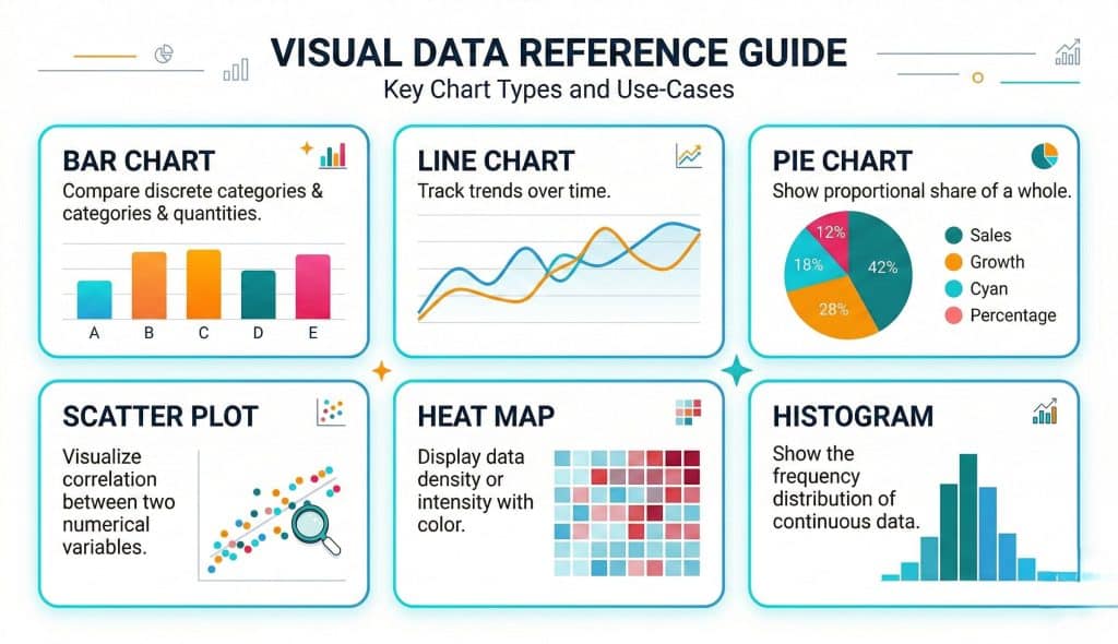
Bar Charts: Comparing Categories
Bar charts are the workhorses of data visualization. Use them when you want to compare distinct groups or categories. They work best when the differences between values are significant enough to see at a glance.
Best for: Comparing sales across regions, showing product performance by category, ranking survey responses.
Avoid when: You have continuous time-series data or too many categories (more than ten starts to look cluttered).
Line Charts: Showing Trends Over Time
Line charts are built for time. They show how a value changes across a continuous sequence — days, weeks, months, years. The slope of the line tells the story instantly. Rising lines signal growth. Falling lines signal decline. Flat lines signal stagnation.
Best for: Website traffic trends, revenue growth over quarters, stock price movement.
Avoid when: You have unrelated categories with no time sequence. A line will imply a connection that does not exist.
Pie and Donut Charts: Showing Parts of a Whole
Pie charts communicate proportion. They answer the question: what share does each part hold? The key rule is to limit pie charts to five slices or fewer. More than that and the human eye struggles to compare the segments accurately.
Donut charts are a cleaner variation. The empty center can hold a key figure, making the chart more scannable.
Best for: Market share breakdown, budget allocation, survey response distribution with few categories.
Scatter Plots: Exploring Relationships
Scatter plots are the go-to chart for showing the relationship between two numerical variables. They reveal patterns, clusters, and correlations that no other chart type can expose.
Best for: Showing the correlation between advertising spend and revenue, exploring the relationship between temperature and energy usage.
Heat Maps: Showing Intensity
Heat maps use color to represent the intensity or frequency of a value across a matrix. They are especially powerful for website analytics — showing where users click, scroll, or lose interest on a page.
Best for: Website behavior analysis, geographic density mapping, displaying correlations between multiple variables.
Data Visualization Best Practices You Should Follow
Knowing the chart types is just the beginning. Applying them well requires following a set of proven data visualization best practices. These are the rules that separate average dashboards from outstanding ones.
1. Start With the Story, Not the Data
Every visualization should answer a specific question. Before you open any charting tool, write down the question your audience needs answered. That question shapes every decision that follows — from chart type to color to labeling.
2. Reduce Visual Clutter
Edward Tufte, the pioneer of data visualization theory, introduced the concept of “data-ink ratio.” (Source: Edward Tufte, “The Visual Display of Quantitative Information,” 2001.) The idea is simple: every element of a chart should earn its place. Remove gridlines, unnecessary borders, redundant labels, and decorative elements that do not add information.
3. Use Color With Intent
Color is not decoration. In data analysis visualization, color is a tool for highlighting, grouping, and directing attention. Use one consistent color for a single data series. Use contrast to draw the eye to the most important data point. Avoid using more than five to six distinct colors in a single chart.
Always consider accessibility. Approximately 8% of men and 0.5% of women have some form of color blindness. (Source: National Eye Institute, color vision statistics.) Use color-blind-safe palettes for all public-facing visualizations.
4. Label Clearly and Directly
Avoid making your audience search for the legend. Direct labels — placed on or near the data — are always more readable than a separate legend box. This small change dramatically improves how quickly your audience absorbs the information.
5. Match Scale to Reality
A common mistake in effective data presentation is truncating the Y-axis to exaggerate a trend. If sales went from 990 to 1,000, starting the Y-axis at 985 makes that small change look massive. Always start your axis at zero unless there is a very clear and disclosed reason not to.
People Also Ask: What are the most important data visualization best practices?
The most important practices are: always start with the story you want to tell, reduce visual clutter by removing non-essential elements, use color purposefully and accessibly, label data directly instead of relying on legends, and always maintain accurate axis scales. Collectively, these habits produce visualizations that are both honest and easy to understand.
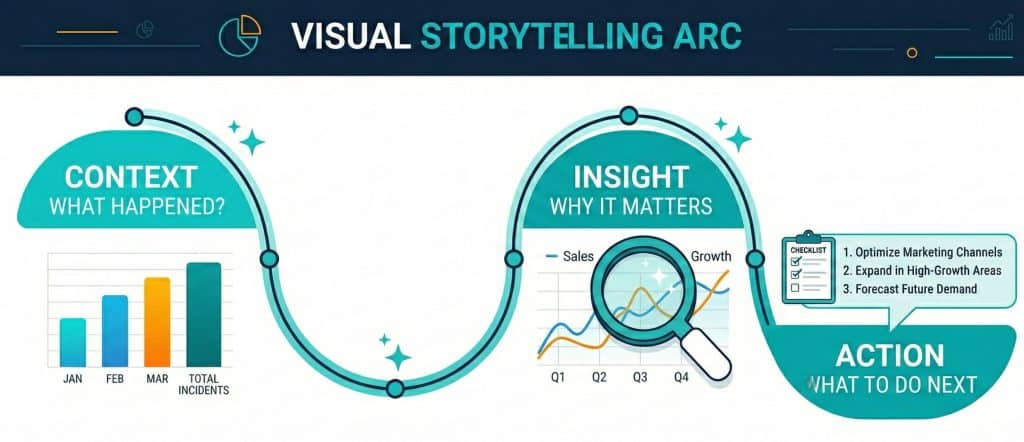
The Art of Data Storytelling: More Than Just Charts
Visualization techniques and chart types are tools. But the real skill in data storytelling is knowing how to sequence and frame those tools to create a narrative that moves people.
Think of your data presentation like a news article. The headline tells the main point. The opening paragraph gives the essential context. The body develops the detail. The conclusion calls for action. Your charts should follow the same structure.
Cole Nussbaumer Knaflic, author of “Storytelling with Data” (Source: Cole Nussbaumer Knaflic, Storytelling with Data, Wiley, 2015), argues that the best data presentations do not just show what happened — they show why it matters and what should be done next. That is the difference between a report and a story.
When you present data as a story, three things change. Audiences engage with it emotionally. They remember the key finding. And they feel compelled to act on it.
Common Mistakes That Kill Good Data Visualization
Even experienced teams make avoidable mistakes. These are the most common ones — and how to fix them.
Using 3D Charts
Three-dimensional charts distort proportions. A 3D pie chart makes slices at the front appear larger than slices at the back, even when the underlying values are equal. This introduces bias and undermines trust. Stick to flat, two-dimensional visualizations.
Overloading a Single Chart
Trying to show too much in one chart creates confusion. If you are comparing five products across three regions over four years, that is likely three separate charts. Break it down. Each chart should answer one question only.
Ignoring Context
A number without context is meaningless. If revenue is $500,000 this quarter, is that good? Without a benchmark — last quarter, last year, the industry average — the audience cannot judge. Always add context to make your visualization interpretable.
Choosing Style Over Clarity
Novelty charts — radar charts, bubble charts, or unusual infographic styles — can look impressive but often obscure the data. Always prioritize clarity over creativity. If your audience needs a moment to figure out how to read your chart, you have already lost them.
▶ Ready to transform your data into compelling stories? Explore Datawitzz’s data visualization services and see how we help businesses turn numbers into decisions. Visit datawitzz.com to get started.
Visualization Techniques for Different Business Goals
Not all business goals call for the same visualization techniques. Here is how to match your chart strategy to your objective.
For Executive Dashboards
Executives need a high-level view, fast. Use KPI cards for single-metric snapshots. Use simple bar or line charts for trend data. Avoid detailed tables — they slow down comprehension at this level. The goal is to answer the question “How are we doing?” within five seconds of opening the dashboard.
For Marketing and Sales Reports
Marketing teams need to show performance over time and across channels. Line charts work for trend data. Grouped bar charts work for comparing channel performance. Funnel charts are perfect for showing conversion rates through the sales pipeline. These are standard, proven visualization techniques for this use case.
For Operational and Financial Analysis
Finance teams deal with variance and composition. Waterfall charts are excellent for showing how a starting value changes through a series of additions and subtractions — like showing how gross profit becomes net profit. Stacked bar charts show the composition of a total. These specialized chart types make complex financial data approachable.
People Also Ask: What is the best chart for showing trends over time?
The line chart is the best visualization for showing how a value changes over a continuous time period. It clearly shows direction, momentum, and turning points. If you are comparing multiple trend lines at once, keep it to three or four lines maximum to avoid confusion. For large volumes of data points, consider using an area chart to emphasize the magnitude of change alongside the trend direction.
How Datawitzz Approaches Data Visualization for Clients
At Datawitzz, every data visualization project starts in the same place: understanding what the client needs the audience to feel, understand, and do after seeing the data.
That might sound simple. But it is the step most teams skip. They jump straight into building charts without ever defining the outcome they are aiming for. The result is technically accurate but strategically empty.
Our process follows four stages. First, we audit the data — understanding its structure, volume, and relationships. Second, we define the audience and their specific questions. Third, we draft the visual narrative, mapping the story arc before selecting any chart type. Finally, we build, test, and refine the visualization against clarity benchmarks.
The outcome is data visualization that works. Not just looks good — works. It changes how decisions get made.
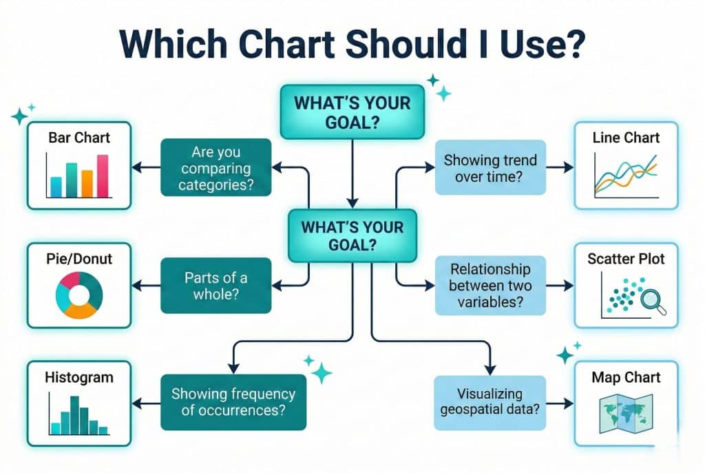
Quick Chart Selection Guide: Match Your Data to the Right Visual
Here is a quick decision framework. Use this as your go-to chart selection guide whenever you are about to build a new visualization.
- If you want to compare values across categories → Use a Bar Chart or Column Chart
- If you want to show change over time → Use a Line Chart or Area Chart
- If you want to show parts of a whole → Use a Pie Chart or Donut Chart (max 5 segments)
- If you want to show a correlation between two variables → Use a Scatter Plot
- If you want to show frequency distribution → Use a Histogram
- If you want to show geographic data → Use a Map Chart or Choropleth
- If you want to show a process or flow → Use a Sankey Diagram or Flow Chart
- If you want to show financial changes step by step → Use a Waterfall Chart
People Also Ask: When should I use a pie chart vs. a bar chart?
Use a pie chart when you want to show how parts contribute to a whole, and when you have five or fewer segments. Use a bar chart when you want to compare distinct values across categories and when the differences in magnitude matter. If you find yourself with a pie chart that has six or more slices, switch to a bar chart — it will communicate the same information far more clearly.
Frequently Asked Questions (FAQ)
Q1: What is the difference between data visualization and data analytics?
Data analytics is the process of examining data to find patterns, trends, and insights. Data visualization is the practice of presenting those insights in a visual format. Analytics answers “what does the data say?” Visualization answers “how do I communicate that finding to others?” Both are essential, but they serve different purposes in the data workflow.
Q2: How many chart types should I use in a single presentation?
Keep it focused. Using two to three chart types across a single presentation is a solid rule of thumb. Mixing too many chart types can make the presentation feel inconsistent and forces the audience to relearn how to read each new format. Consistency in chart choice also reinforces your visual brand.
Q3: Are dashboards considered data visualization?
Yes, absolutely. Dashboards are a form of data visualization that consolidates multiple charts and KPIs into a single interactive view. Good dashboards apply the same best practices as individual charts: clarity, appropriate chart selection, minimal clutter, and a clear hierarchy of information.
Q4: What tools are commonly used for data visualization?
Popular tools include Tableau, Microsoft Power BI, Google Looker Studio, D3.js for custom web visualizations, and Python libraries like Matplotlib and Seaborn for programmatic charts. The best tool depends on your data complexity, technical skill, and whether you need static reports or interactive dashboards.
Q5: Can bad data visualization hurt business decisions?
Yes, significantly. Misleading charts — whether through truncated axes, inappropriate chart types, or cherry-picked data ranges — can cause decision-makers to draw entirely wrong conclusions. This is why following data visualization best practices is not just about aesthetics. It is about integrity and accuracy in business communication.
Q6: How does storytelling with data improve audience engagement?
When data is framed as a story — with context, a clear insight, and a recommended action — it triggers both the analytical and emotional parts of the brain. This dual engagement makes the message more persuasive and more memorable. Research by Uri Hasson at Princeton (Source: Uri Hasson, Princeton Neuroscience Institute, “Coupling of Brain Activity During Communication,” PNAS, 2010) shows that storytelling synchronizes the brains of speaker and listener, improving comprehension and trust
Conclusion: Your Data Has a Story to Tell — Make Sure It Gets Heard
Data visualization is not a technical skill reserved for analysts and designers. It is a communication skill that every professional who works with data needs to develop.
The right chart, chosen for the right reason, presented with the right context, turns raw numbers into undeniable stories. It creates clarity where there was confusion. It builds trust where there was skepticism. It drives action where there was hesitation.
The data visualization best practices in this guide are not abstract theory. They are the same principles that drive every project at Datawitzz. We apply them to help businesses see their data differently — and communicate it powerfully.
You now have a solid chart selection guide. You understand the types of charts and graphs available to you. You know the rules of data storytelling. You have the visualization techniques to match your business goal to the right visual.
The only step left is to put it into practice. Start with your next report, your next dashboard, your next stakeholder presentation. Choose the right chart. Tell the story clearly. Watch the difference it makes.
🧠 Data Visualization Knowledge Quiz
Test your understanding of chart selection and data storytelling — 7 questions.